Models
Linear Regression
Our group’s initial attempt to predict future energy consumption and spending came about through a linear regression model. This model was specifically created through Scikit-Learn’s linear regression function and utilized info that came with the original dataset, apart from the cost values and the floored timestamps, such as humidity, outside air temperature, and setpoint values for temperature and airflow. The floored timestamps were split into different variables for day, hour, minute, second, and weekday. There was insufficient data to use the year value, and month was excluded for the linear model because of an anomaly in the data where October had much higher median values than the other months.
Decision Tree
After testing the performance of linear regression, our group worked with a variety of predictive models. One of these attempts revolved around the decision tree method. Creating this predictive model was fairly straightforward due to the similar usage of Scikit-Learn in implementing the decision tree functionality. This model worked with the same data and transformations analyzed by the linear regressor (including information about zone temperature, outside air temperature, and time). The regressor’s max depth was set to 7 and the minimum samples split to 5 after testing different values via cross-validation.
Prophet
The next three models are non-Scikit-Learn based, more complex models we attempted. One of these models is the open source Prophet model6, developed by Meta’s Core Data Science team. The model makes time-series based predictions with several seasonal trends measured: yearly, monthly, weekly, and holidays. (Please note: with the way the data was split when testing this model, there was not enough data to analyze yearly trends).
The Prophet model is a little less diversified than the other models we tried because it uses exclusively time series values (left as a timezone-naive timestamp) and the predictor variable (energy/cost when transformed) - leaving out the other data we have available to us surrounding humidity, temperature setpoints and more. It relies entirely on the timestamps provided which are flawed for this dataset because of the inconsistent time ranges, uneven timestamps, and missingness we noted earlier. Nevertheless, we looked at Prophet as an option because of strengths it has apart from that downside: it is quick to train (2-3 minutes each time we ran it) and can easily generate future predictions with the make_future_dataframe method. This means that the model can quickly be retrained and is easy to evaluate for future data, should we be able to obtain it.
Neural Net
Another model our group created was an artificial neural network (ANN for short). For the ANN model, the uncleaned data and the cleaned data were again both used. We used the TensorFlow and Keras libraries to train the model to predict energy from the other features, and fit the model to optimize for MSE. We attempted to improve this score by iterating over different batch sizes and epochs. Unfortunately, in the end, the model failed to converge, as seen in the output score of “negative infinity”, for both the uncleaned and cleaned data, across all combinations of hyperparameters. As such, we opted to proceed with the other models and improve their performance, as reaching an outcome with the neural net model would have taken extra heavy lifting and not guaranteed improved performance.
Autoregression
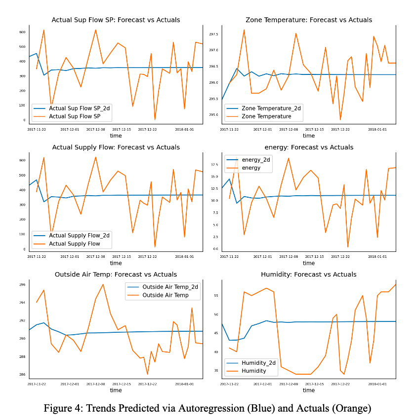
In this section, we explored the use of Vector Autoregression and regular Autoregression. The statsmodels library provided us with the necessary statistical tests and models. Initially, we performed data cleaning and transformations, followed by Granger causation, cointegration, and ADF tests to determine if the features would work well with the model. Although the Granger test yielded suspiciously good results and the other two displayed normal positive results, we proceeded after validating the order parameter. However, upon plotting the predicted values against actuals, we found that the model predicted mostly straight lines with some curves in the beginning, and did not identify any meaningful visual patterns. We attribute this to the large gaps in sensor readings.
Moreover, intuitively, we do not expect energy to affect the power used by AHU, so we suspect that the vector autoregression may not have worked due to the lack of influence between the features and labels. As a test, we modeled a regular autoregressive model using a time frame with consistent sensor readings. However, this limited us to 51 data points, of which only 10 were used for testing. While the model’s prediction correlated with actual values, it was nowhere near the true values. As a result, we will not use this model for the time being, but will revisit it once more data has been collected.
Optimization
Air Setpoint & Occupancy
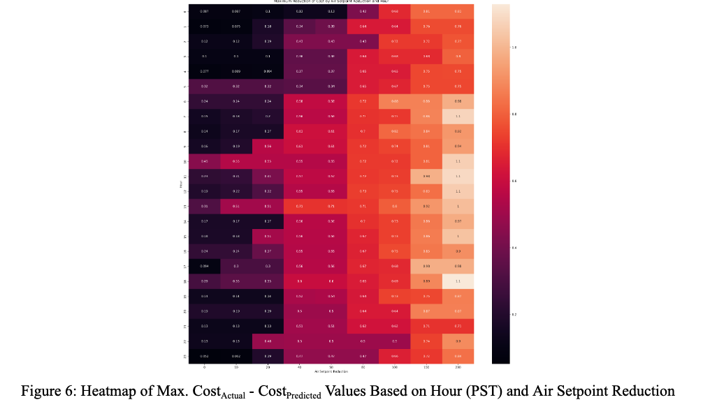
We expected the airflow setpoint factor to be one of the largest predictors of HVAC cost since the amount of energy an HVAC unit has to use depends on its airflow needs. Our initial results seemed to suggest this was true, as the airflow setpoint values had a wide range of maximum differences that we explored [6]. Examining these maximum differences show that there is a clear pattern of larger cost reductions tied to higher airflow setpoint reductions (which is expected), but also that the most impact is seen in the middle of the day (about 6am - 6pm).
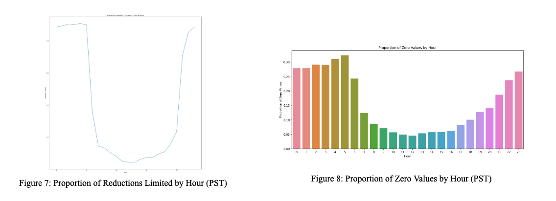
This distribution can partially be explained by another figure, where we tracked the proportion of times the reduction we performed was not fully able to reduce the airflow setpoint to the desired value because it ran into one of the three occupancy lower limits (0, 45, or 100) [7]. As we can see, the proportion of measurements that were unable to be reduced by a given air setpoint reduction value is high from 10 pm - 5 am, and then lower during 6 am - 9 pm. While it’s unclear exactly what the cause of this is, our intuition was that it was likely that the HVAC system was completely turned off from 10 pm - 5 am, and was on from 6 am - 9pm (slightly extended business hours). We examined this intuition with a bar graph examining the proportion of zeroes (representing no occupancy and the lowest possible airflow setting) at each time of day [8].
We then looked more in depth at the occupancy analysis we performed. We created two bar graphs representing the median differences (between training and optimization cost) by hour and airflow setpoint, respectively, segmented by the three different occupancy limits we tried [9, 10].
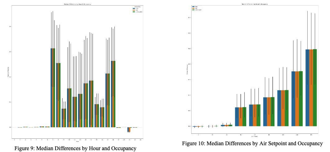
What we find is that overall, the different occupancy limits seem to have inconsistent effects on these median differences. Carefully examining the median differences by air setpoint shows that the unoccupied level has a slightly higher difference for each air setpoint difference, but that trend is not reflected for each hour (only reflected during the main workday at 9 am, 10 am, and 2 pm). These results were surprising to us, as we know that occupancy has a significant relationship with airflow because air needs are tied to the number of people in a room, and led us to believe something with our data needed further analysis.
We also saw a large change in the first figure between the median differences at the beginning & end of the work day (7-8 am, 5-6 pm) compared to the rest of the day which was not visible in our heatmap of maximum differences. This also contributed to the idea that this optimization analysis had limits. We believed that there could be an energy toll associated with the start and end of the day - we examine this notion later in the section below.
Exploring Temperature & Flaws with Optimization Process
The other change we made for the sake of optimization was reducing temperature setpoint values, but creating similar visuals to the airflow setpoint changes showed even less of a change. This is when we looked at the model’s feature importance to see if we had made a mistake [5].
It turns out that we had made a mistake, albeit not with our visualizations. Rather, the temperature setpoint value was very unimportant to the overall cost calculation, ending up as the fifth least important feature. Examining these model weights demonstrated the actual values (highlighted in orange) instead of the user-set values we changed (highlighted in yellow) were more important in the model. Looking at visualizations for the variables provides some further insight into this [11].
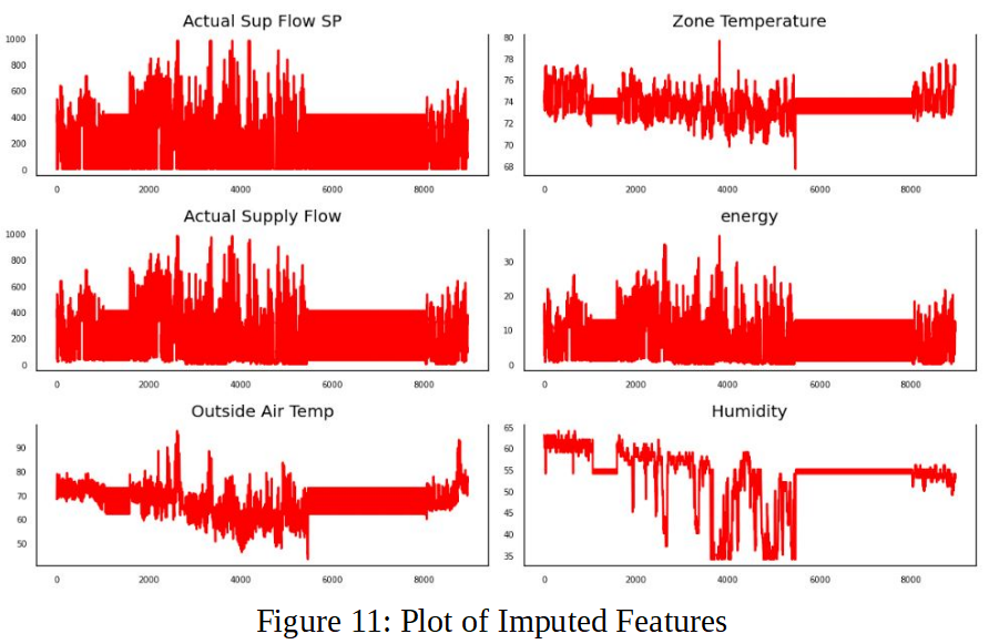
Via Figure 11, the outside and zone temperatures both had very different distributions to the temperature setpoint, so those trends are likely more important to monitor than the temperature setpoint values for energy costs. Optimizing temperature likely involves figuring out how temperature setpoint can be made to more closely match zone temperature. More interestingly, the difference in the feature importances for the actual airflow values and the airflow setpoint values ended up surprising us and led us to reexamine our initial optimization work. We plotted a regression of the airflow values against each other to compare the two [12].
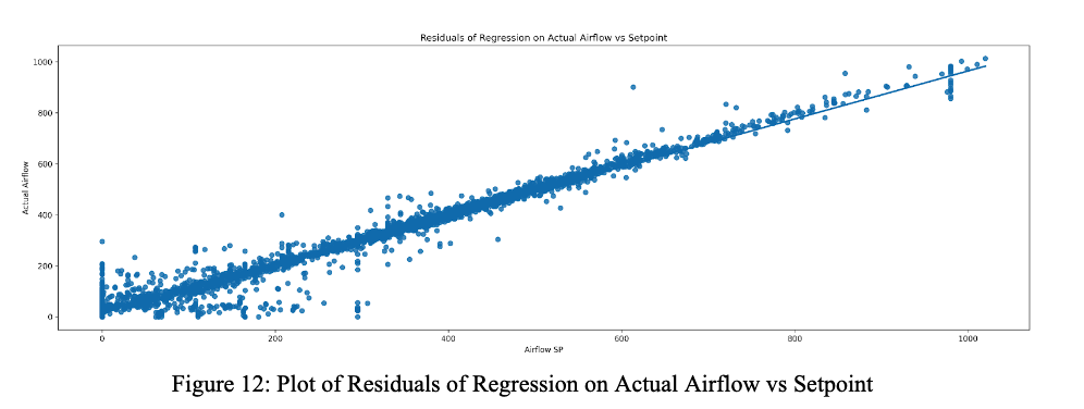
As seen in the plot, the actual airflow and setpoint values are mostly correlated, except for a set of anomalies where one of the values is set to 0 and the other values are not 0. So instead of optimizing the airflow as we were intending when we reduced airflow setpoint, we were likely optimizing for these cases. This provided a new perspective for our optimization attempts for airflow setpoint: understanding when these differences tend to occur and improving the HVAC system to output airflow to better match the setpoint values would be the key to more successful optimization attempts. Then, airflow and the airflow setpoint could be treated as the same variable and be permuted in the way we attempted to. In a way that we did not anticipate, the difference between the two variables circled back to the idea of occupancy and occupancy limits - when does a user say they are in a space compared to when air actually outputs to a space? This also acts as an explanation of the time periods when our optimization was most successful, between 7-8 am and 5-6 pm: these periods likely represent when a user turns their local HVAC system on and off, which causes larger deviations from the actual supply flow values. For future analysis into optimizing how to limit deviations between actual values and setpoint values and optimize energy values, looking at these periods would likely be the first step.